An initiative doesn’t mean anything if nobody remembers it. NCompass Consumer Segmentation was a robust, deeply thought-through initiative by Nestlé’s Commercial & Marketplace Insights team to turn around the financial performance of the company’s brands. Like most strategy, it risked living in decks instead of in people’s heads. I took that complexity and translated it into something much harder to ignore: a visual system designed to move through the organization the same way people do. Each segment became a shorthand—distinct, recognizable, and easy to reference for people to internalize the strategy without trying.
Since its debut in September 2024, over 30,000 Nestlé employees across functions, levels, and time zones have been exposed to and have adopted this visual language in sales and marketing strategy discussions. Even to this day (written April 2026), these stickers keeps the consumer segmentation strategy relevant, appearing throughout the company ecosystem in both digital and print.
Nestlé
September 2024
CONTRIBUTION
Creative & Design Direction
TEAM
Group Creative Director: Ameesha D.
Print vendor: Stickermule
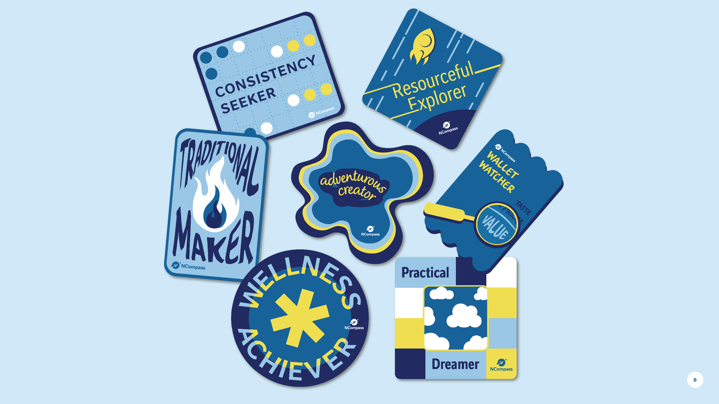
THE SYSTEM
Consumer segment names and their defining traits were already established, so the work became about translation, not invention. I built a color palette pulled directly from the corporate system to keep it ownable, then pressure-tested it across contexts: small enough to live on a laptop or water bottle, clear enough to hold up on a slide, bold enough to read on a screen from across the room, and differentiated from one another. Shape did the heavy lifting for recognition. I assigned each segment a distinct form so it could be identified at a glance, even without text. My goal was to create a set of assets that felt unified and could scale across physical and digital environments without losing clarity or impact.

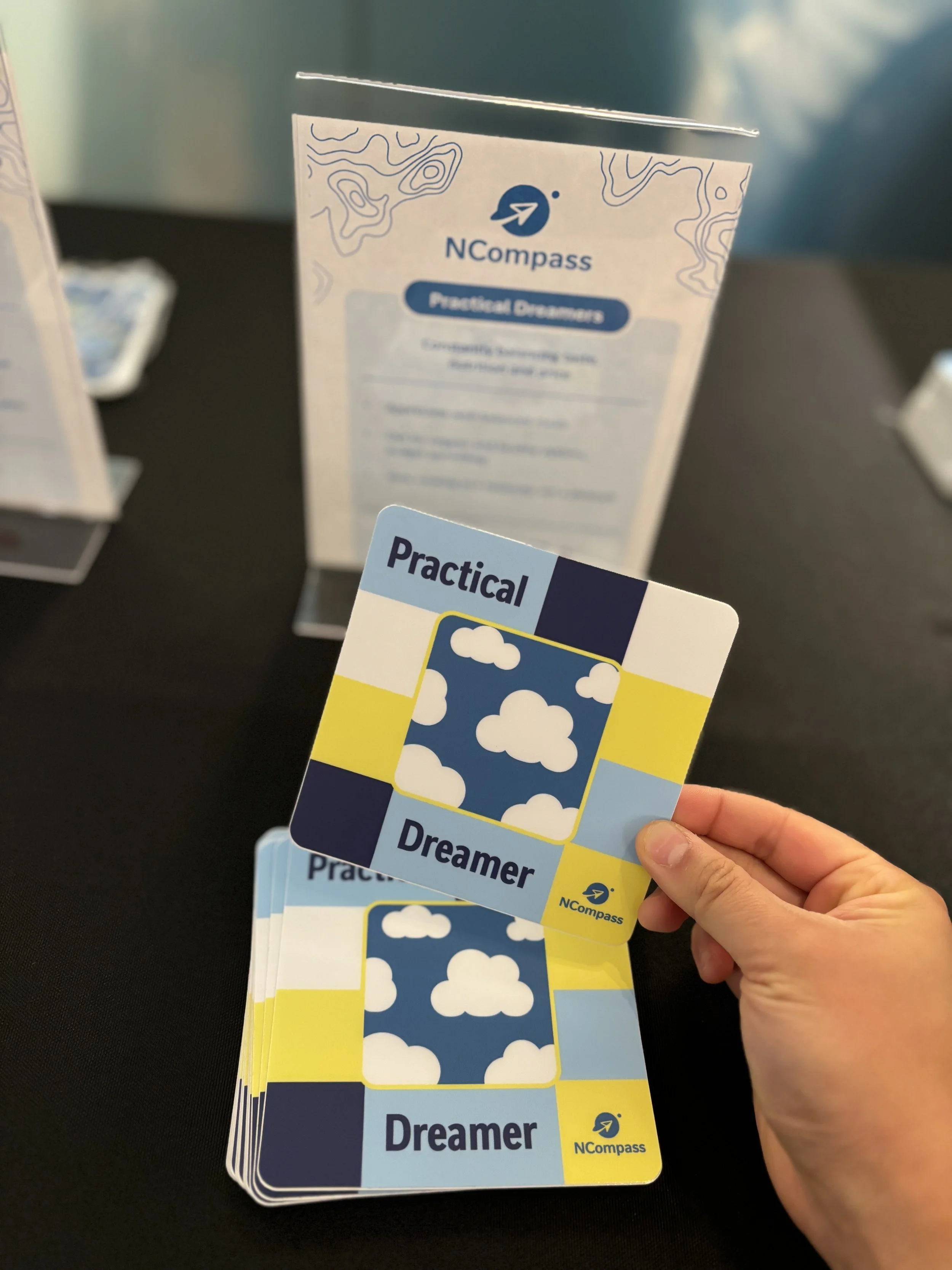
PRACTICAL DREAMERS
are constantly balancing taste, nutrition, and price and making tradeoffs in real time. I visualized that tension as a view to the outdoors, something open and aspirational but held within a structured frame of other blocks. The composition reflects constraint and possibility in this segment’s decision-making.
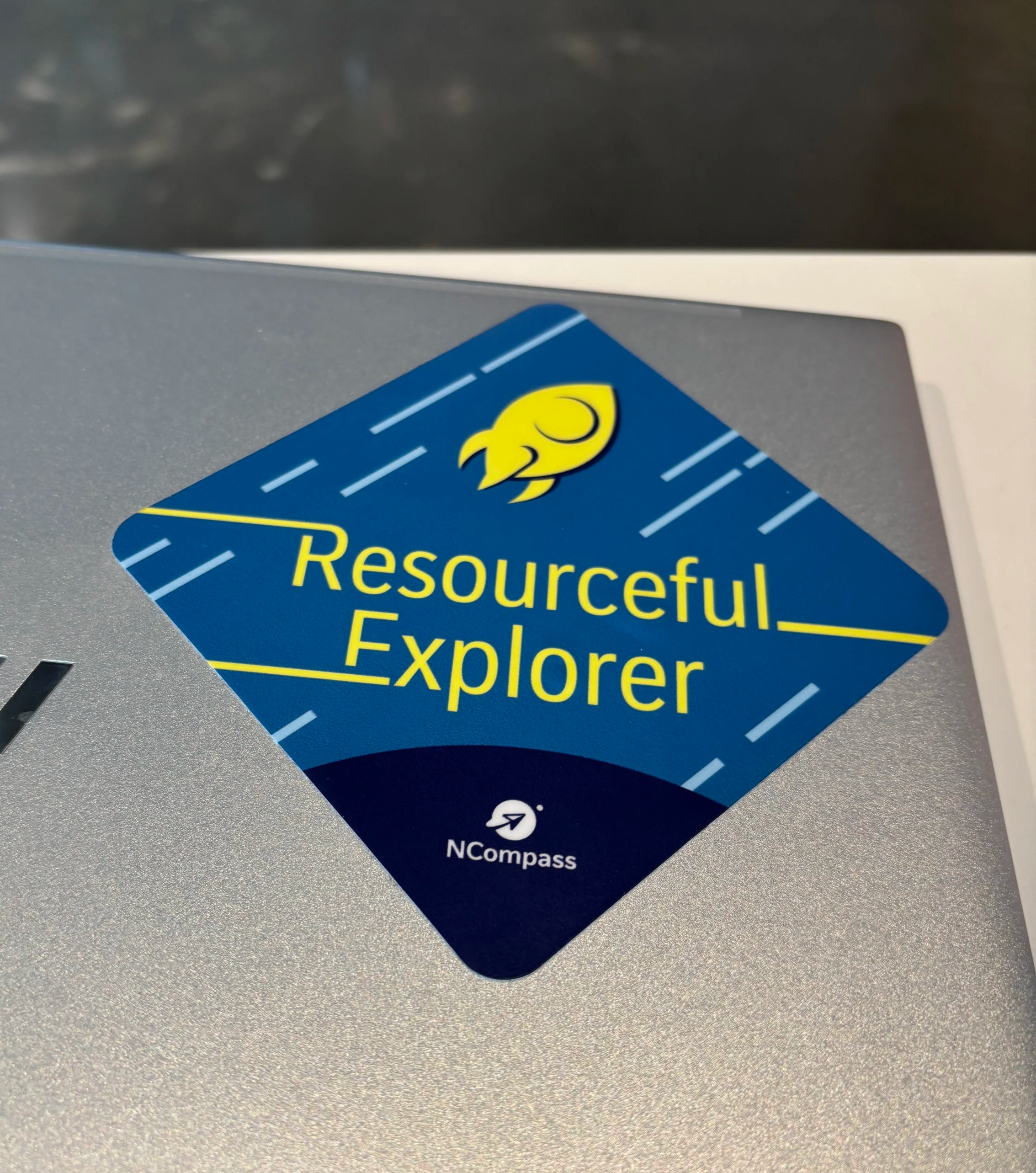
RESOURCEFUL EXPLORERS
want healthy efficiency. They’ll pay for convenience and are often the first to try something new. I pushed the type to the edges to create a sense of pushing past one’s own boundaries. The directional layout nods to a future-facing mindset, while the rocket reinforces exploration driven by necessity, not novelty for novelty’s sake.
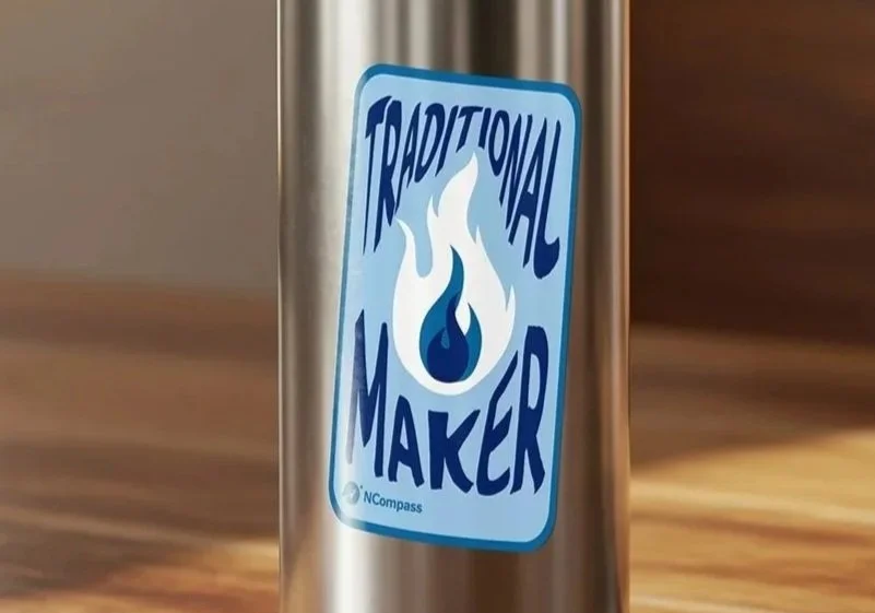
The VP of Consumer Marketplace Insights— himself a TRADITIONAL MAKER— flagged a concern early: Would this segment come across as “boring”? I pushed back. With fire as one of the earliest human inventions and still the epicenter of gathering, cooking, and connection, I learned into its role as a symbol of community. The warped type mirrors the movement of the flames, reinforcing the sense of warmth and togetherness that this segment creates with food.
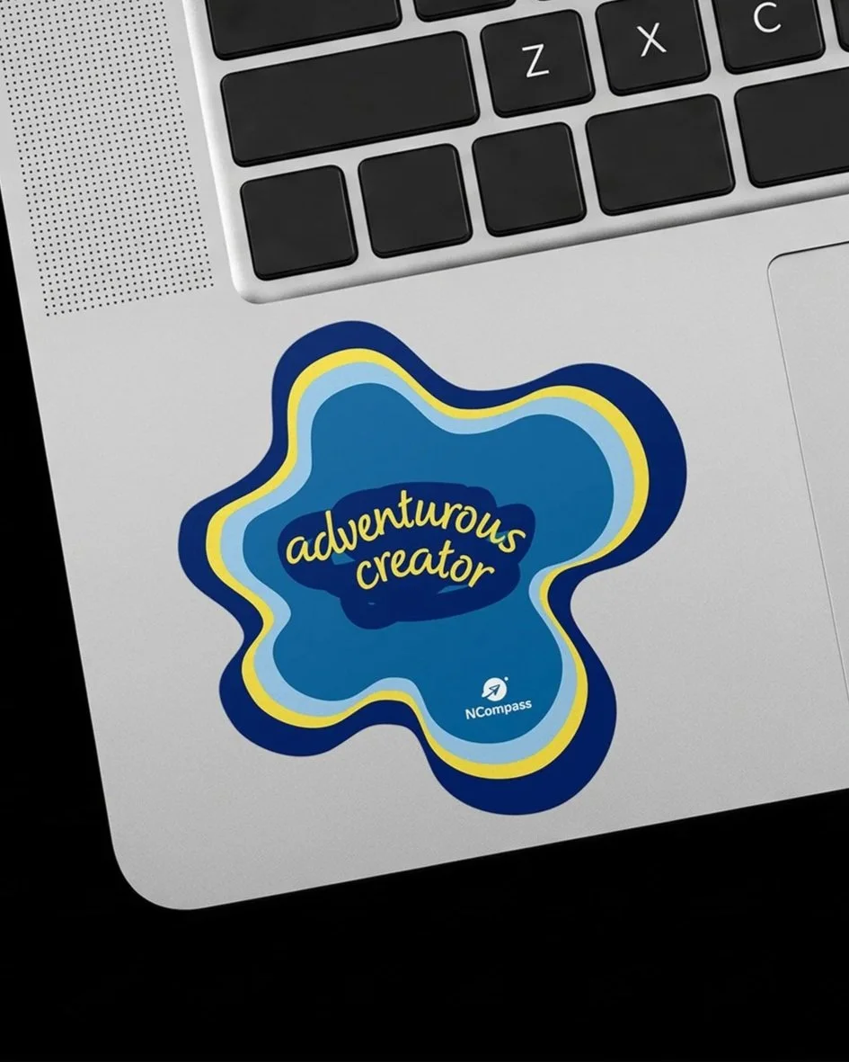
ADVENTUROUS CREATORS
treat cooking as a creative outlet— experimenting with falvors, remixing recipes, and choosing to cook at home. Instead of a clean geometric shape like the other stickers, I broke the system on purpose to show a fully organic paint blob. It feels made, not manufactured. The irregular form, along with the pen scratches at the center, signal freedom, creativity, and playfulness characteristic of this segment.
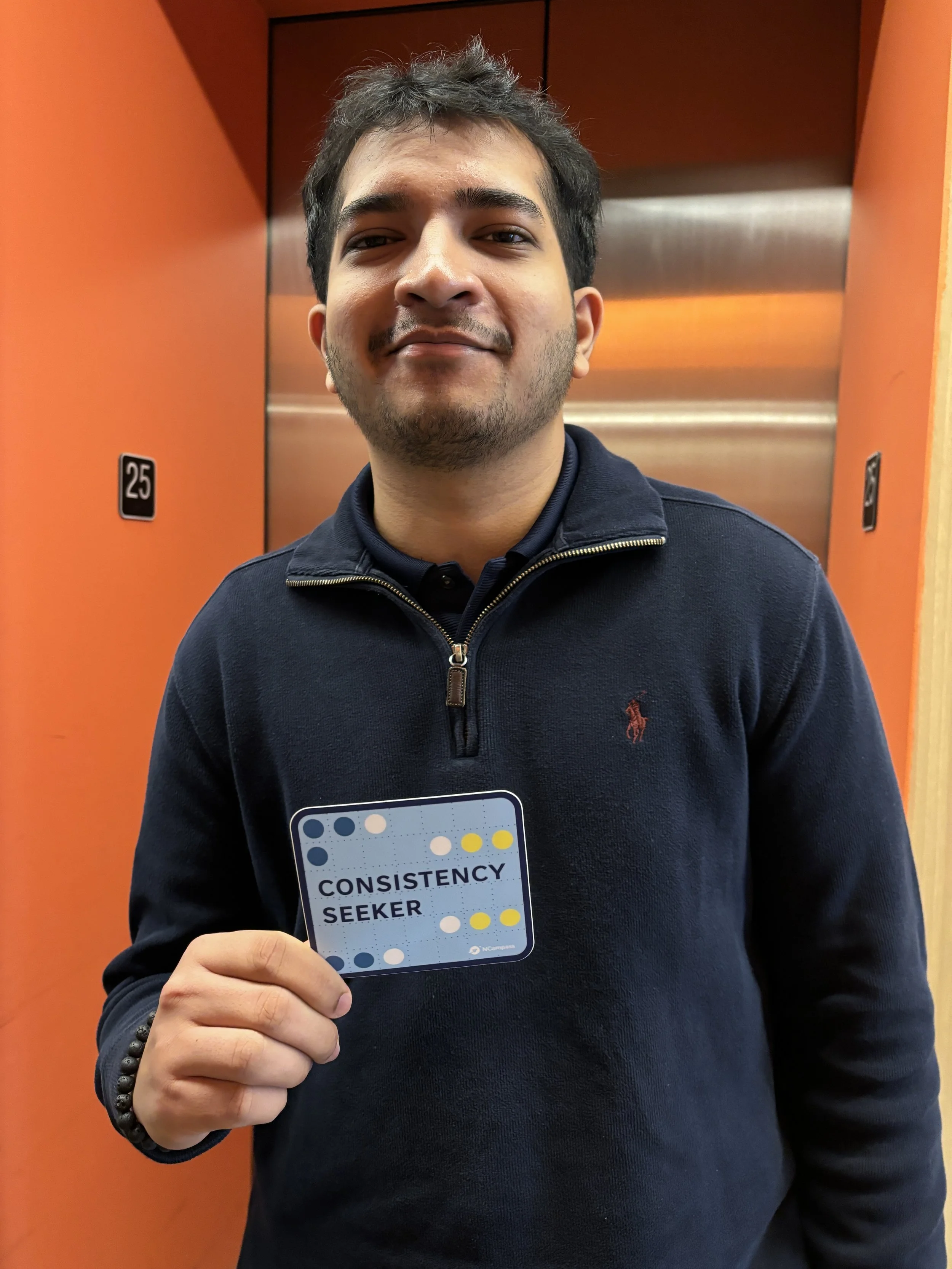
CONSISTENCY SEEKERS
know what they like and they stick to it. They gravitate toward familiar flavors, simple foods, and prepared options. I expressed that through a tight matrix of repeating dots, grouped in similar colors. Everything is intentional, orderly, and predictable. This visual repetition reinforces reliability and routine, emulating a mindset that values consistency over change.
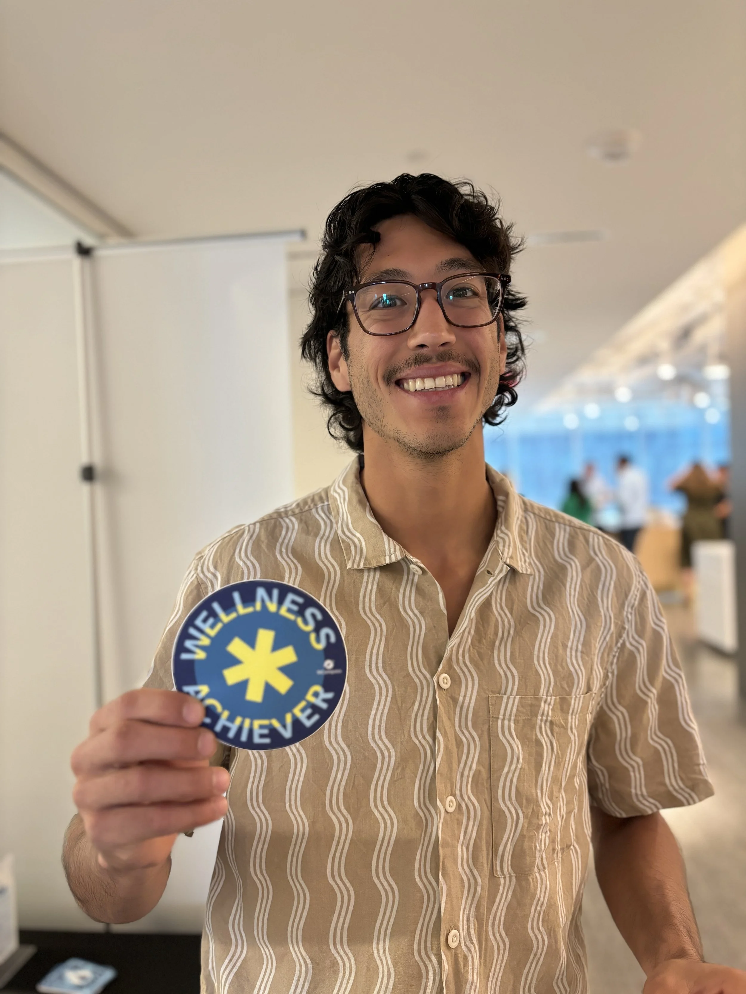
WELLNESS ACHIEVERS
see food as part of a balanced lifestyle and are therefore willing to invest in quality and health benefits. I represented this as a six-sided shape within a circle, built on strict symmetry to reflect control and balance. The form can be read as an asterisk as well, nodding to this segment’s habit of reading labels and paying attention to what’s back-of-pack.
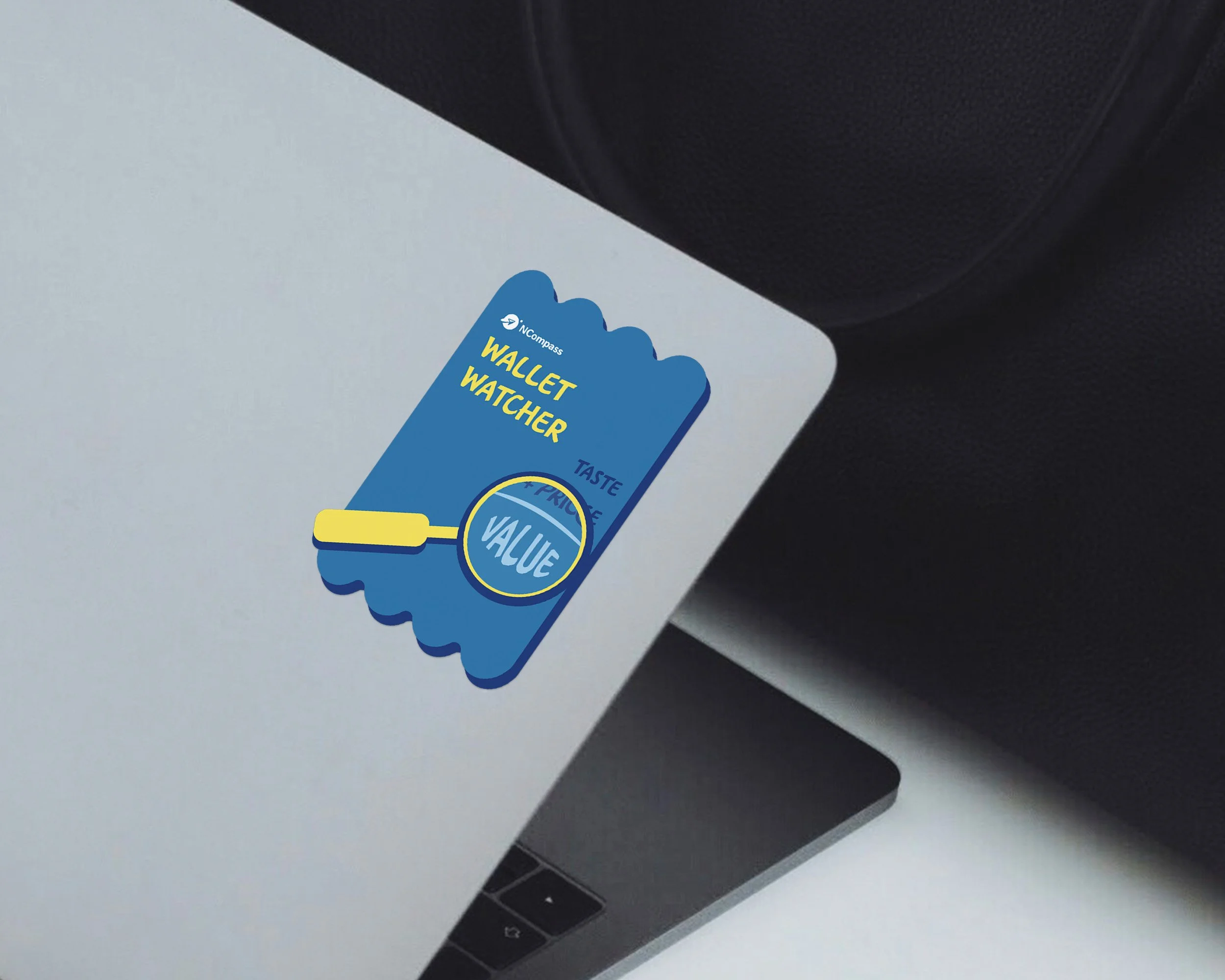
WALLET WATCHERS
are value-driven by default, making sure that every dollar spent counts. For that reason, they’re very familiar with a grocery store receipt, which served as the inspiration behind this sticker’s shape. Here, value is literally calculated as the sum of taste and price. Each line item becomes part of that tradeoff equation running through this segment’s mind at all times.