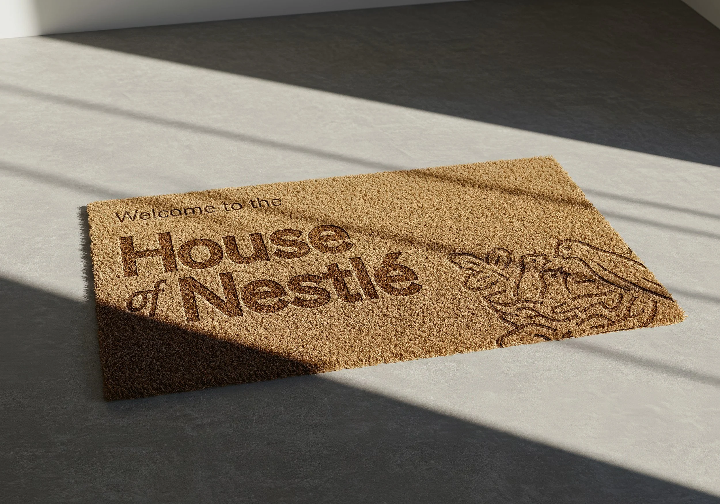
House of Nestlé was a one-day media event in New York City designed to turn upcoming 2026 innovation into earned attention. I stepped in as Design Director after the original agency support fell through, partnering directly with the PR team to translate strategy into a physical and digital design system. Using Nestlé’s existing color palette and typography constraints, I built a unified visual language that could live across every touchpoint of the event. My intent was to shift the tone of this Fortune 500 company into one that was intentional, warm, and inhabitable.
My design system played a key role in this event’s success by making the experience visually consistent, immediately recognizable, and aesthetically memorable in an otherwise crowded media environment. The event generated over 167M impressions across .com and social, as well as 17 earned placements, including coverage from Food Dive, Tasting Table, Bloomberg, The Street, Fortune, and Allrecipes. Reporters actively pursued follow-up stories for Toll House, Coffee mate, and Hot Pockets, indicating sustained editorial interest beyond the event itself.
Nestlé
March 2026
CONTRIBUTION
Design Direction
TEAM
PR/Earned Media: Olivia J. and Jen R.
Graphic Designer: Sofia F.
THE DESIGN INTENT
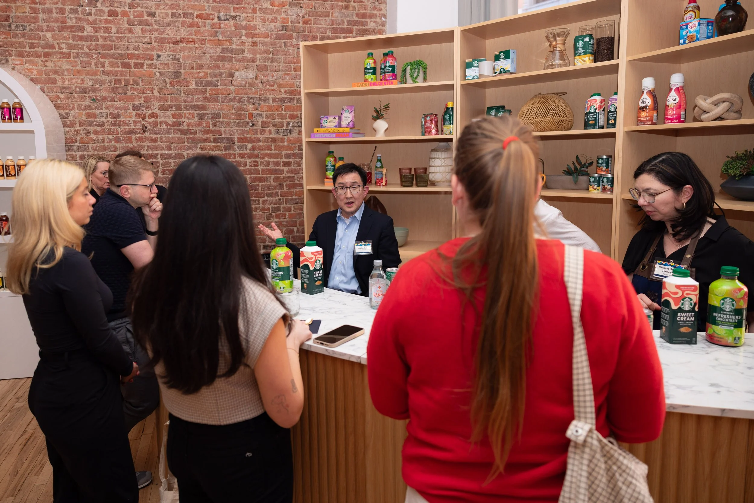
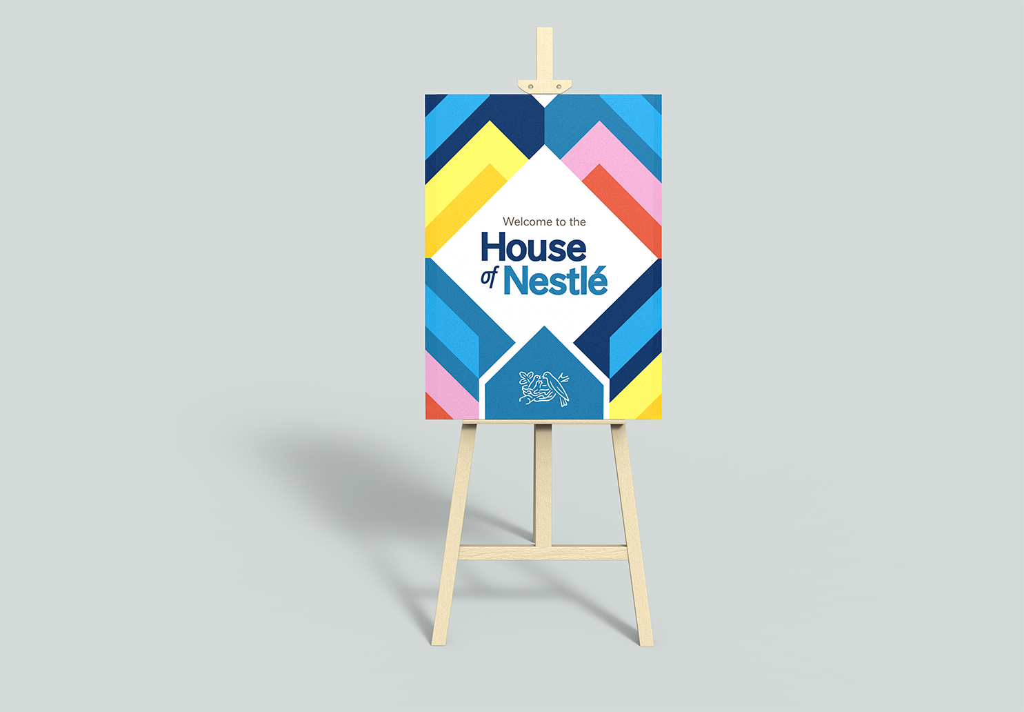
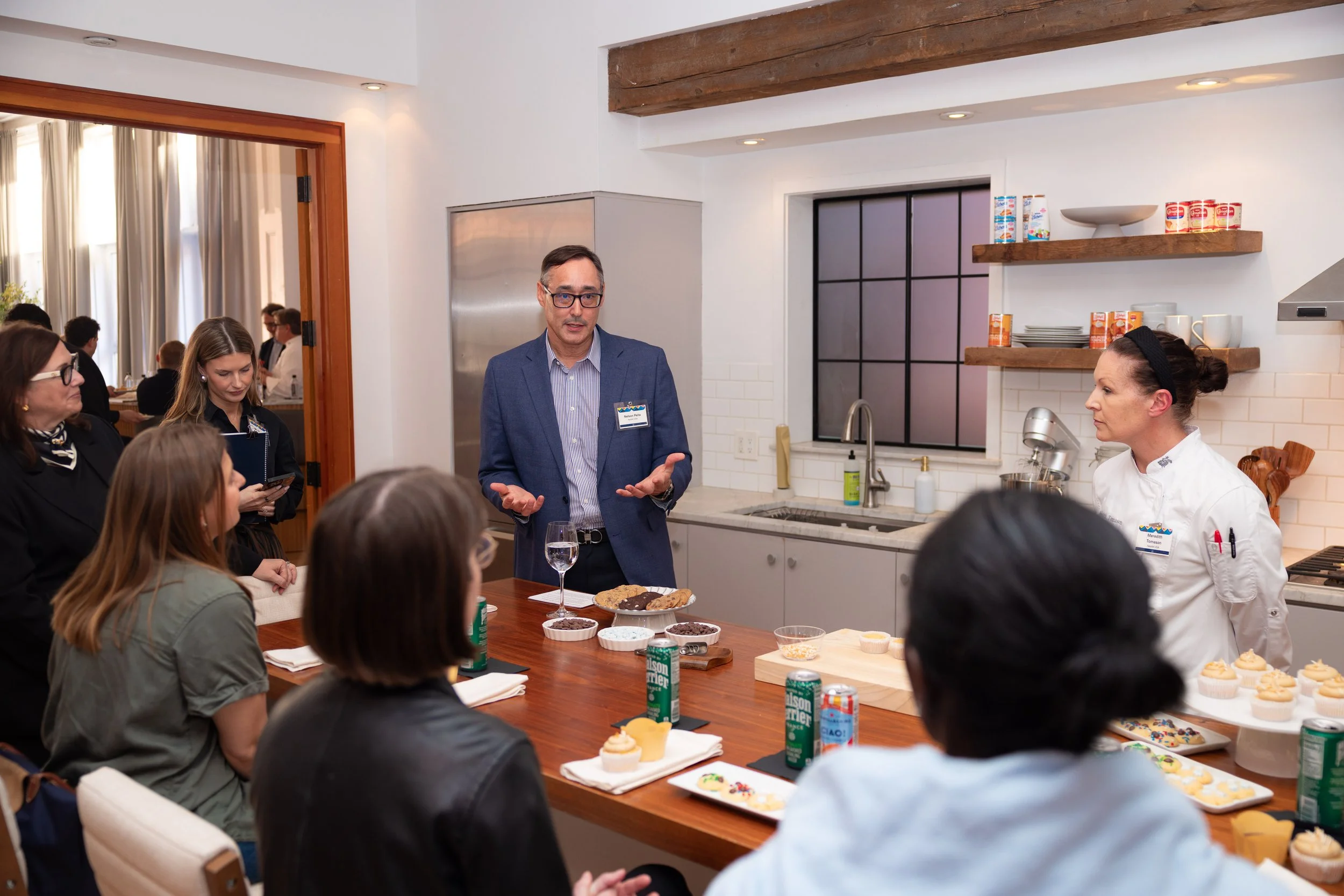
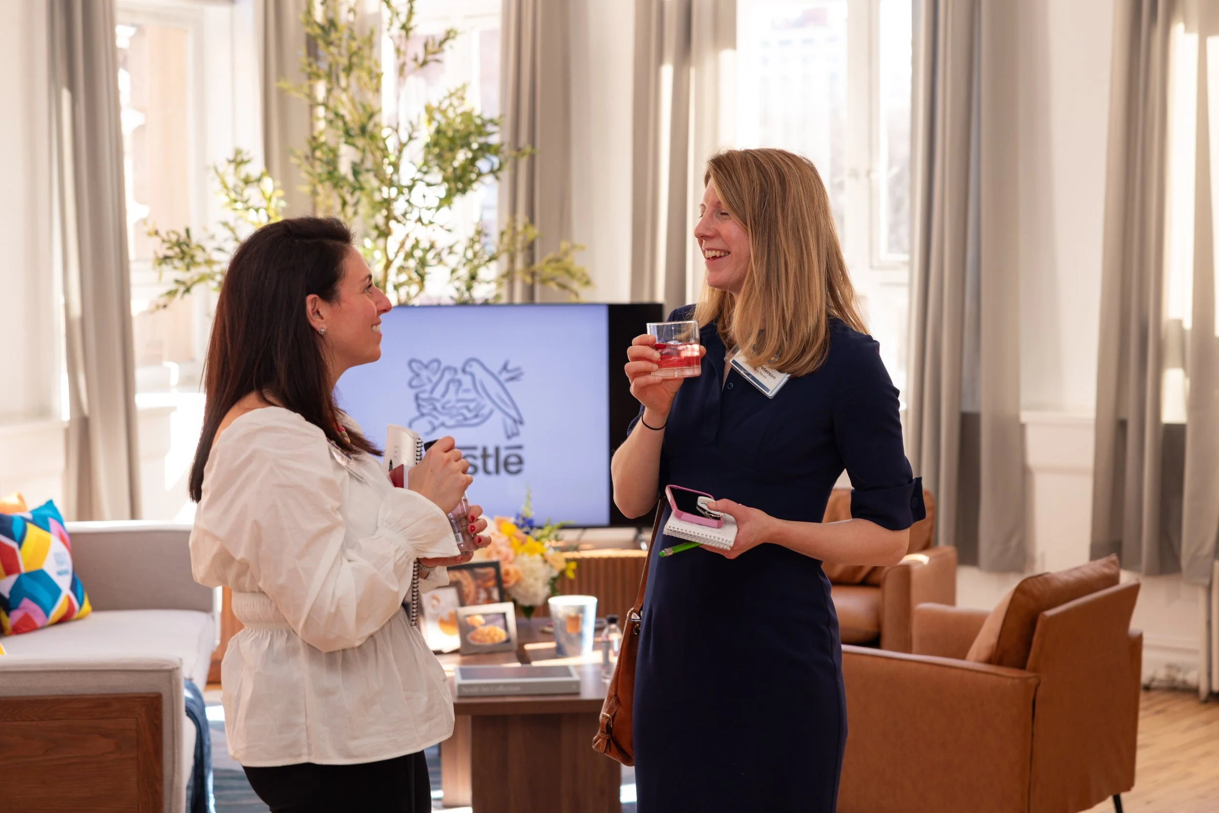
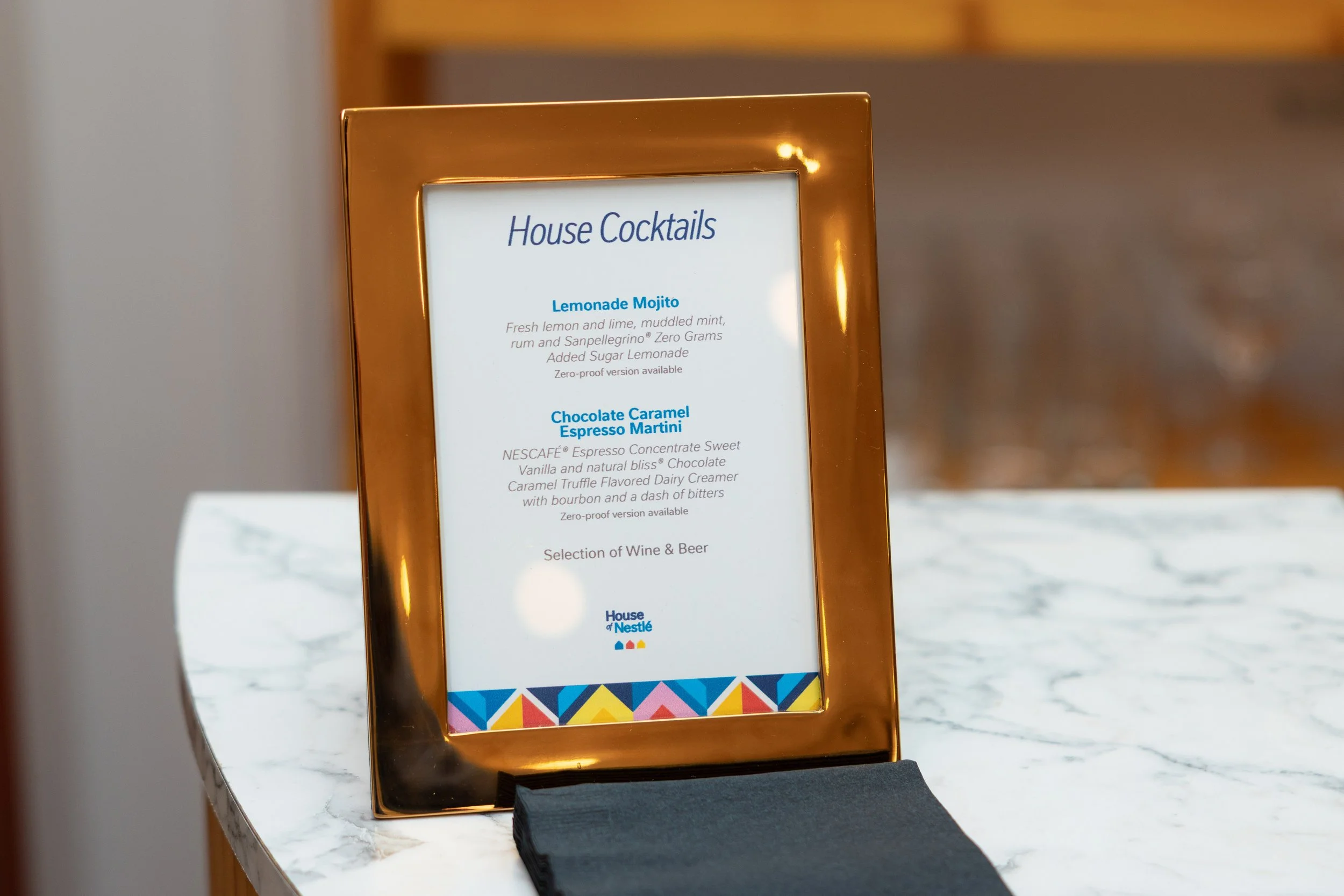
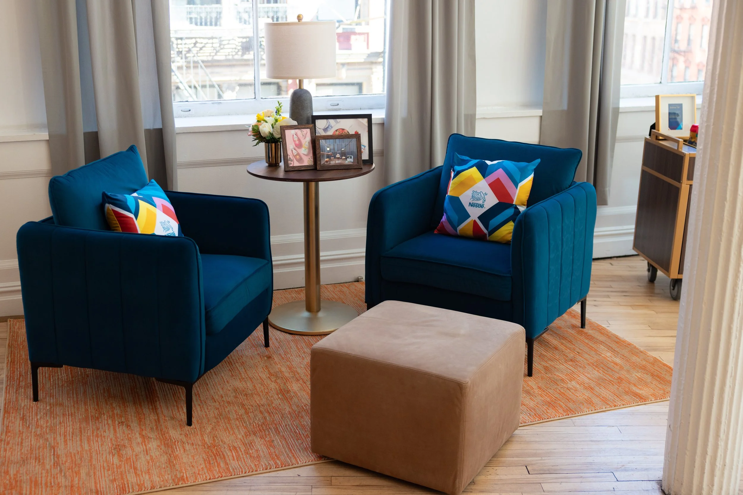
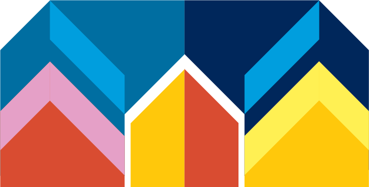
I wanted the design to create a cohesive world where strategy, products, and people could coexist without friction. With the CEO, CMO, President of Coffee & Beverage, and President of Frozen Foods all in attendance, alongside elite chefs demoing innovations live for press, the experience needed to carry weight without feeling heavy. I leaned into the familiarity of the classic pentagonal “house” shape and used tessellation as a structural device to build rhythm and continuity in the space. A heavier reliance on Nestle’s secondary color palette helped push warmth and approachability, shifting the system away from corporate rigidity towards something more lived in.

THE VISUAL SYSTEM
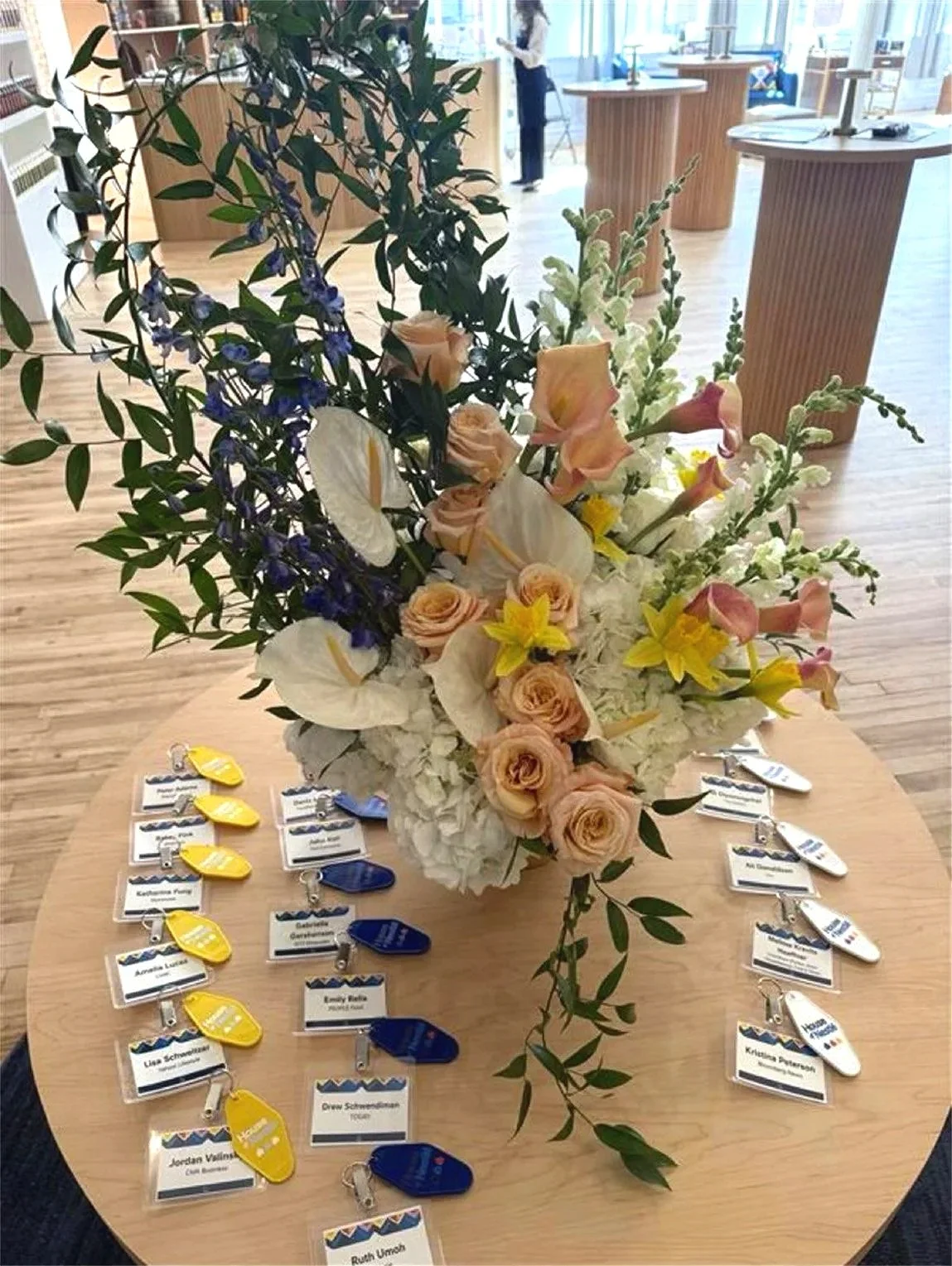
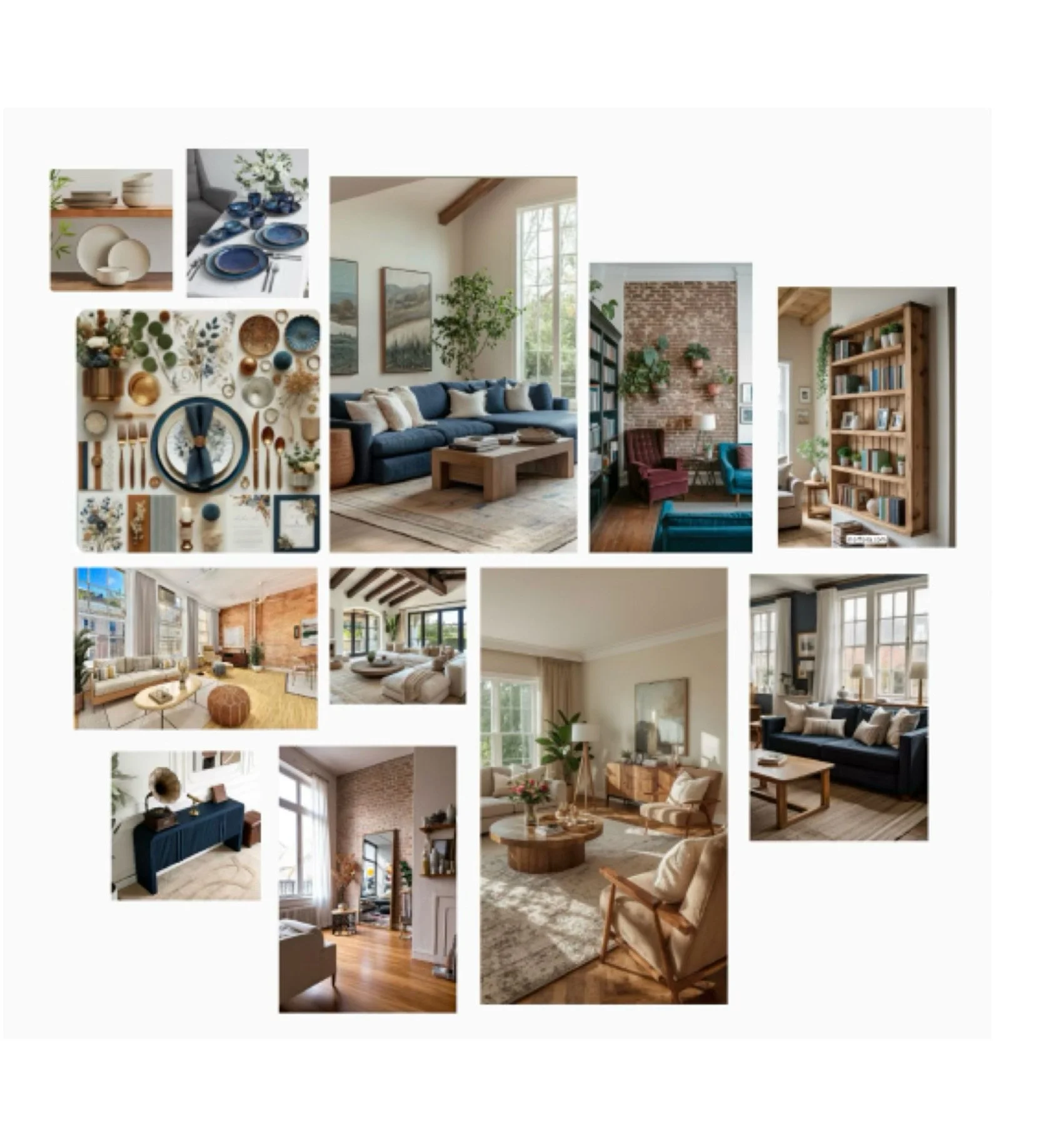
I worked within Nestlé’s existing palette and typographic system but tightened how it was deployed to create clarity and hierarchy across environments. Consistency would unify the multiple brand stories, and versatility would allow each innovation moment breathe on its own. Through a modular design system, I was able to scale this identity across signage, decks, screens, and press facing materials without losing cohesion. An unforeseen delay in event agency direction prompted me to develop a mood board. This board not only got my team kicked off on design early, but it also became a working spec for the agency, as they used it directly to guide material choices and environmental decisions. It set the visual temperature for the entire space before anything was physically built.
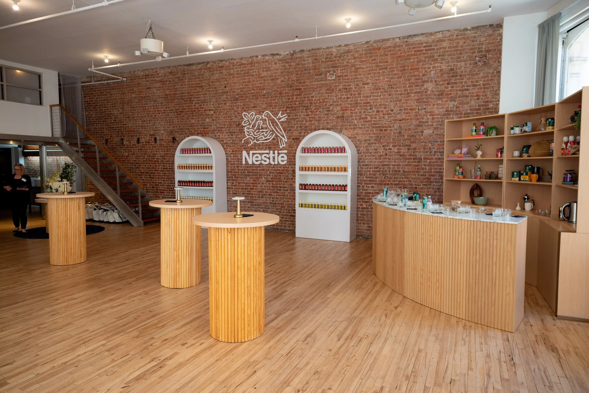
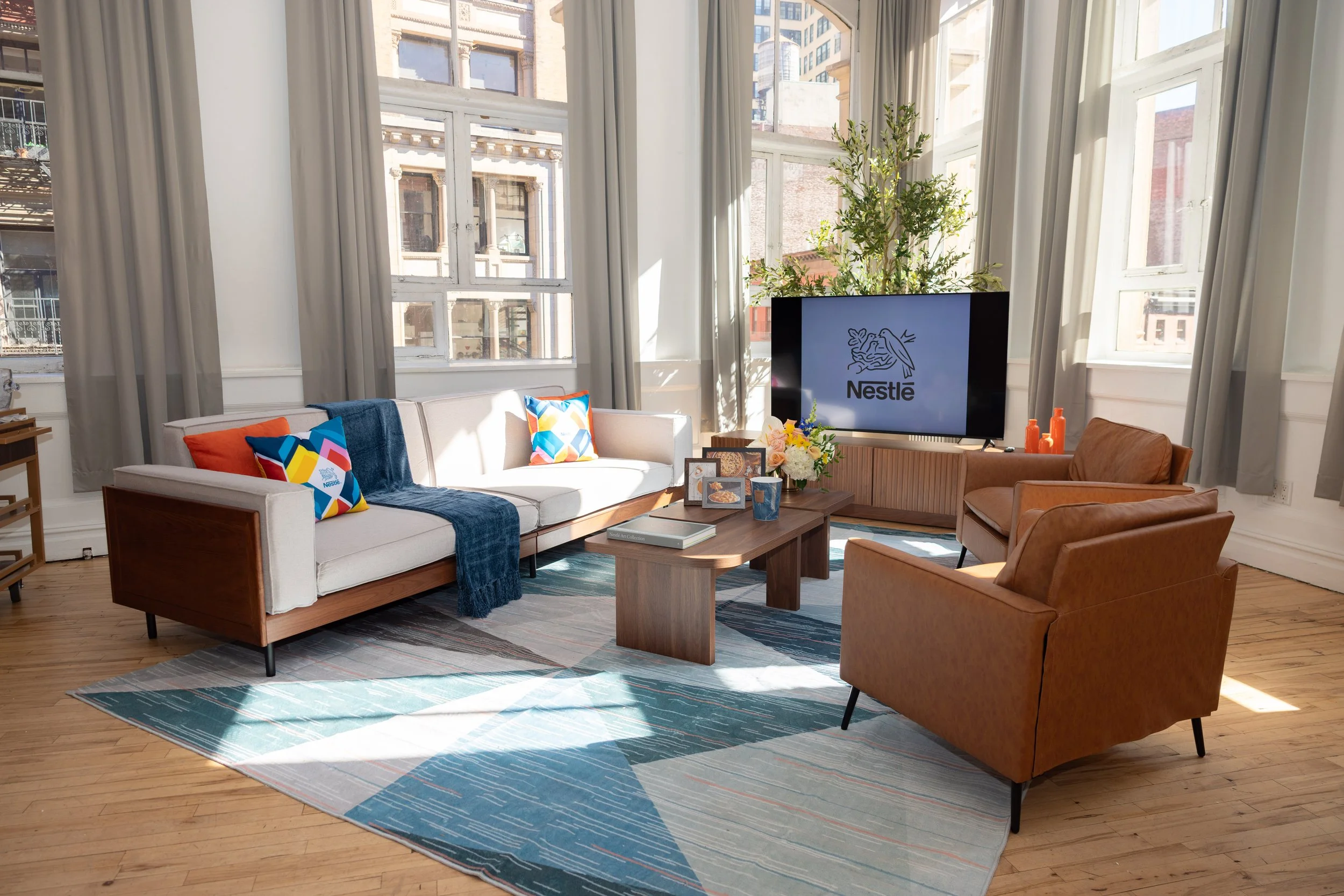
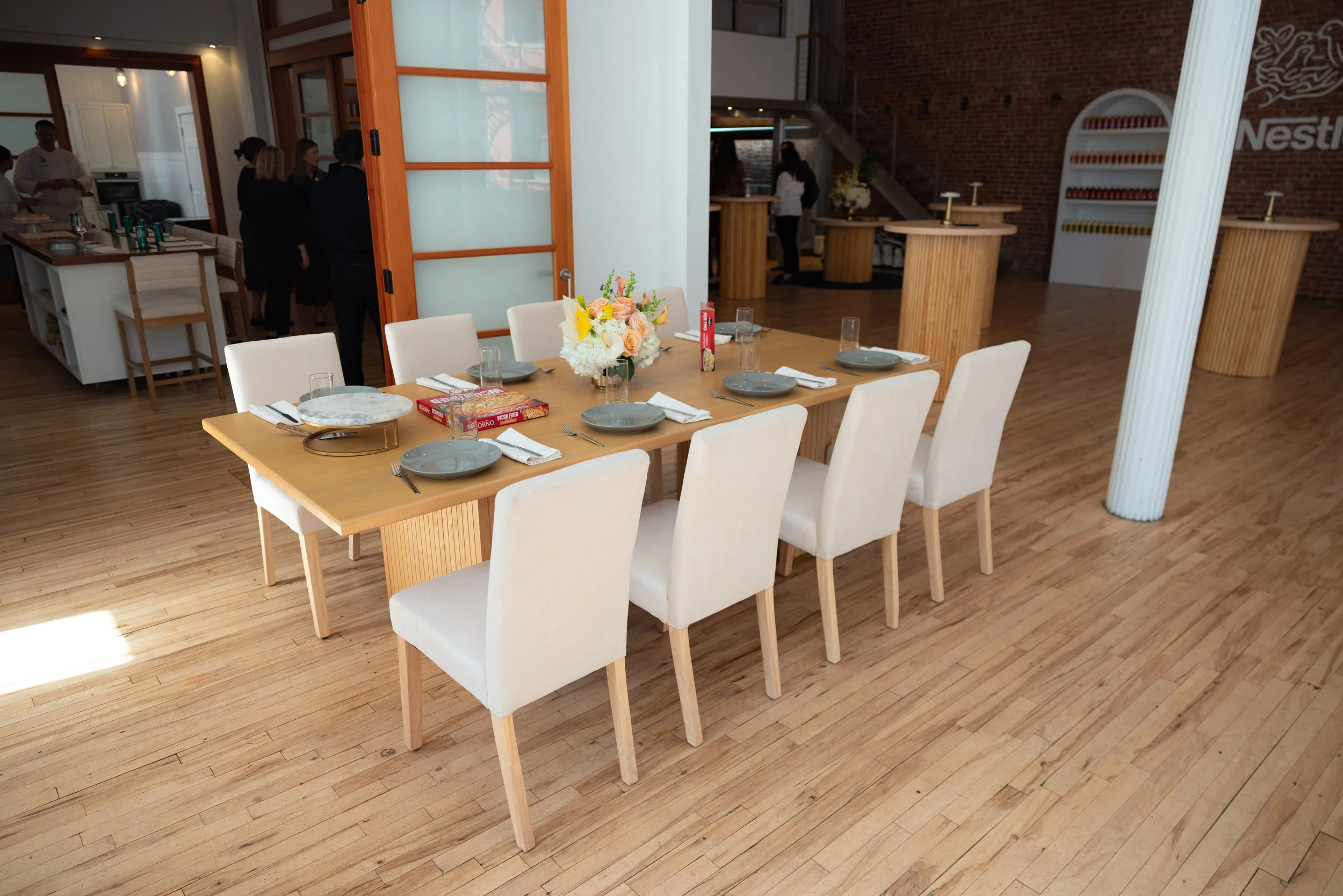
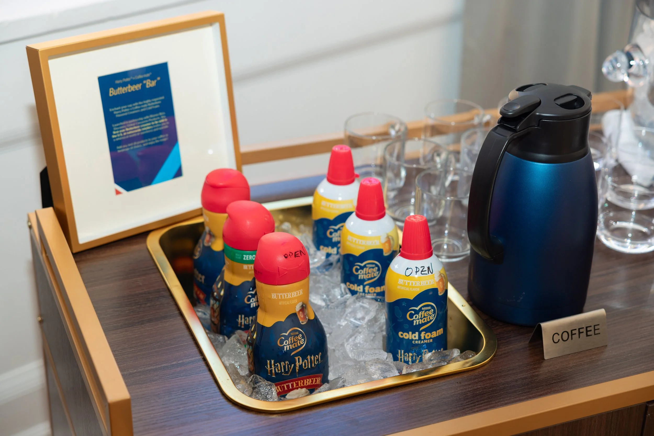
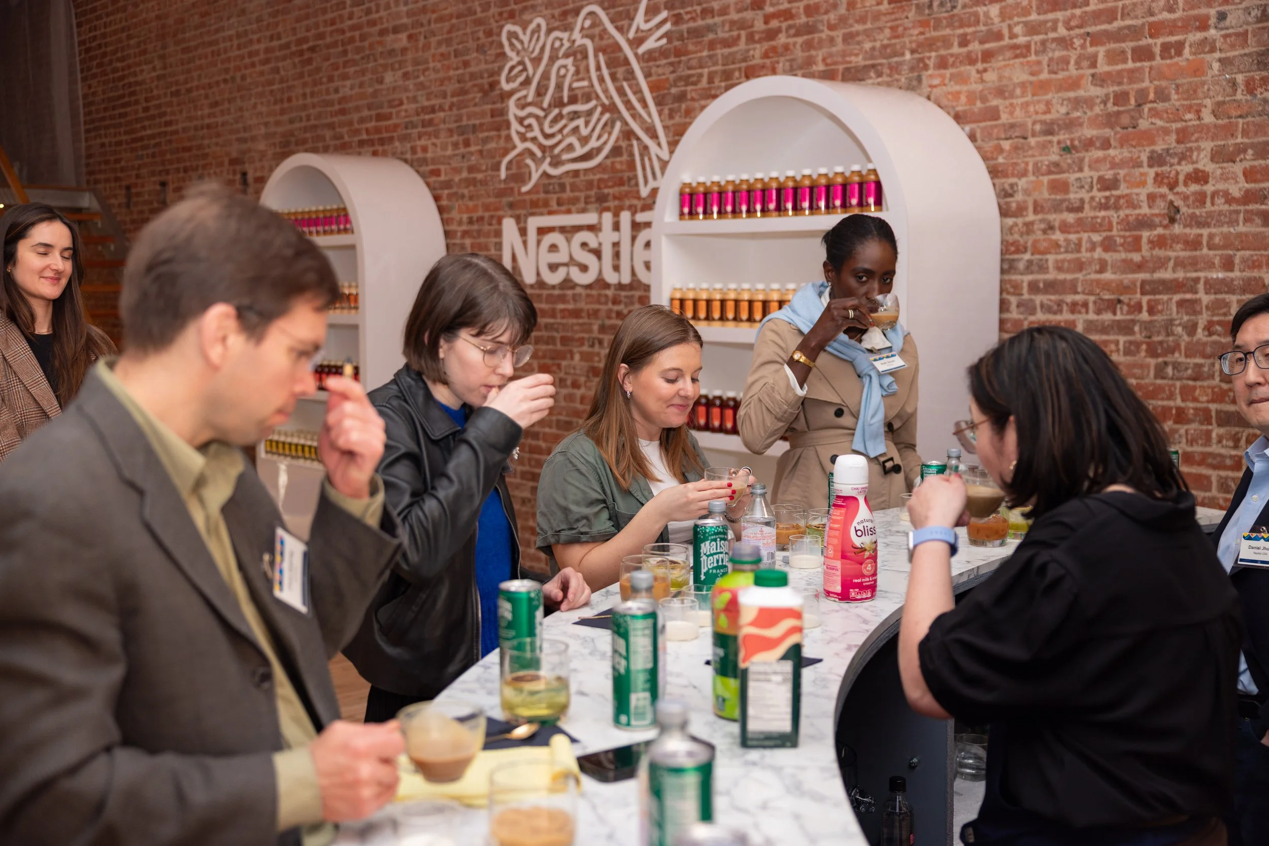
DESIGNING FOR MOVEMENT
The event was structured as a sequence of category-based stations, each centered on a major innovation pillar within the Nestlé portfolio. Rather than presenting everything at once, the experience was designed to move media through distinct narrative zones—each with its own moment, story, and product focus. This created a deliberate rhythm to how information was absorbed, shifting the experience from static showcase to guided editorial journey. The design system acted as the connective tissue between stations, ensuring each felt distinct but never disconnected. Every transition was intentional, reinforcing Nestlé as a coherent house of innovation, as opposed to a collection of unrelated launches.